
Clever use of graphics settings in Second Life can make taking pictures in world much easier and more effective, as well as letting lower end computers still produce high quality images. Knowing which to use when speeds up photography, especially in circumstances outside of the photo-studio, where lag and other people can be much more of an issue. Above is the final image we're working towards, using shadows and windlight settings to draw a strong diagonal across the image straight to her face, while simultaneously anchoring the image with the clock toward in the deep background.I'm also working to minimize a couple of issues at play which I'll point out as we move our way up through the levels of systemic complexity. I would find moving around with the above settings a real challenge, and framing an image almost impossible; the lag on my system is simply too intense for detailed movement.

This is Second Life at close to the bare minimum, and it's an excellent setting with which to set your composition due to the lack of lag; I can make minute alterations to cut out things I want to de-emphasize or to achieve a certain emotive effect. Unclicking "Basic Shaders" in the Firestorm Phototools panel gives you a Second Life that looks like this, but all of these settings exist within the "Preferences" menu as well. The fullbright tree in the deep background is much more obvious without competing lights, my ear no longer matches my skin, and everything looks much flatter and disconnected but without the distraction of a lot of details, compositional choices become a lot simpler.

Adding just the Basic Shaders gives you a Second Life which looks like this - muted, but reflections on the water show up and the quality of light being used becomes more obvious - in this case a warm palette. This can be a place to explore different water settings; the reflections dominates the middle ground of this image, so what's going on with them really matters. On the downside, the addition of reflections highlights the alpha edges of the marble fence - while the top is three dimensional, the bottom is only a texture and that flaw undercuts the image but is part of working within other peoples' creations instead of making my own! Also, I fell in love with this long view of Venice and so couldn't resist trying to capture the feeling of wonder I had when I stepped out and saw it.

Atmospheric shaders bring Windlight to the table, taking the sky from flat to interesting and adding a bunch of light. This windlight - [TOR] NIGHT Flyer - is an especially bright one because I wanted to have high contrast on the clock tower in the back - I really liked the effect of one side in bright light and the other in shadow that I saw in other windlights as I was flipping through to find the mood I wanted. For this one, I'll have to do a spot edit of the time of day, but otherwise it's pretty perfect. You can see how it adds a real sense of depth as well as making the sky more interesting via the swiftly moving clouds in the background.

Turning on the Advanced Lighting Model is a precursor to using shadows, and you can see how it modifies and mutes the light effects, all but removing them from the buildings behind. I just thought this level was interesting because, when I'm not taking pictures, this is what I tend to explore Second Life under. It's not quite as low lag as no shaders at all, but it's significantly less blinding as just windlight alone.
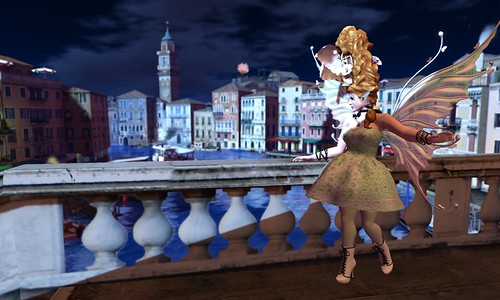
Here is shadows added in, and you can see how the brightness of the light now fits with the hues of the shadows brought by the Advanced Lighting Model. This has the contrast on the clocktower I wanted, it's just a little too high so that the middle and foreground are completely in shadow - that can be fixed here, or fixed after the final touch of verisimilitude below. Notice as well that the full-bright tree in the far back is also lit up, but with the brightness of the surrounding buildings it blends in much more effectively.

The final touch is depth of field, which adds a pleasing softness the further you go back. Part of my initial composition was putting me in focus - the trick is to alt click to place your focus where you want it and then move the camera using controls; if I were to at-click in the middle of the picture, the buildings in the far background would go into focus and my figure would go out of focus. In addition, I take my pictures at several times the size of my screen, so in world the depth of field has to be significantly more fuzzy than it seems to get an effect like above. Once everything is fuzzed the way I want it, I can adjust the time of day to highlight my face and arm, and brighten up the middle ground, while leaving half of the foreground in shadow. The line of the shadow gives away that the foreground balustrade is a flat texture, but other than that I'm really pleased with how it turned out.
Credits:
Skin: Izzie's, Irene
Hair: Curio Obscura, Stackable Hairstyle (gacha)
Decoration: Atomic Faery, True Colours Cockade (June's Genre)
Eyes: .:Soul:., Oculos
Eyelashes 1: SLink, Mesh Lashes
Eyelashes 2: Flugeln Brise, 05-A
Ears: .:Soul:., Uni
Lips: Delusions, Candy Stain
Wings: Deviance, Sidhe
Necklace: LouLou&Co, Mary-A (June's Genre)
Body: SLink, Hands & Feet
Outfit: Sn@tch, Therese Party Dress (June's Genre)
Bracelets: katat0nik, Buckle Wrist Straps
Stockings: Sn@tch, Cute AF Stockings (June's Genre)
Shoes: G Field, Lace-up Boots "Gina"
Pose: Grafica, duwiau iv mirror
Location: Venice
Windlight Settings: TOR, NIGHT Flyer
Water Settings: Glassy
Photographed by Deoridhe Quandry
Post processing: Cropping
No comments:
Post a Comment